A few weeks back Sugarpill had a special Halloween sale on their shop where they sold 'Monster' palettes, i.e. their regular palettes that had some minor defects in them. I ordered the Burning Heart palette on a whim and I got it on Friday.
I know that some of you were interested to see what would a monster palette look like so I took you some pics! And swatches too!

Since this post will be picture-heavy, the story continues after the jump...
To be honest, I really had to look for any defects, although some came more obvious when I swatched and tried the colours on. But in all I'd say that I've seen worse stuff sold as pristine products.

This is how the colours look. The orange is called Flamepoint and although you can't see from this picture, it's a bit uneven when you really look at it. The yellow one, Buttecupcake, has a noticeable dent in it. The red shadow, Love+, doesn't have any oddities as far as I could see. Poison Plum (purple) is a bit uneven and the formula is by far the worst of these (I'll come back to that later).

Flamepoint is a matte orange and because it's matte, it's very hard to get a picture of the clumpiness it has. There's a little dent on the lower left but that's the only defect that shows up in photos. However, the clumpiness doesn't affect the formula. It's as smooth as butter to apply which is very rare for matte colours.

Buttercupcake is a very bright and opaque matte yellow. It has several dents, two of which are visible on the photo (upper left and there's a small crater in the middle). Like with Flamepoint, the imperfections are not translated to the formula, this one is very smooth and lovely to apply.

Love+ is a bright red with a hint of shimmer. This one is perfect by appearance and applies evenly. However, it turns dark pink on my skin, not bright red. I don't know if this is caused by a problem in the formula or just my skintone.

Poison Plum has the same semi-shimmery finish as Love+. It looks nearly perfect but this photo shows how chalky it is compared to the other colours and unfortunately this one applies unevenly. Of course the real monster in my palette had to be the purple one, argh!
Now on to the swatches (on TFSI + Pixie Epoxy):

This photo was taken without flash, by a window (it's the time of year in Finland where hours with sunlight are becoming rarer). As you can see, Flamepoint, Buttercupcake and Love+ look much more vibrant than Poison Plum.

The same arrangement (with flash) but in this photo Poison Plum looks so much better! It's because of the shimmer it and Love+ has. This monster Poison Plum is a lie. It wants you to think I'm being paranoid but it's really blotchy and difficult to apply. I swear!

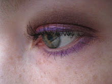
I didn't do a full face look but I did try to paint my eyes. First of all, my blending skills are non-existent. That's why I usually don't wear brights. second, I took this picture to show you how Love+ really looks like pink/magenta on me and I was trying to be very heavy-handed with it. Poison Plum looks good in this photo but if I close my eyes.. HORROR. And it can't be just my blending skills because the colour just won't apply evenly. Even if I try layering it, there are patches with no purpliness on my lids.
Again, the colours are much more vibrant in person than in photos.
Did you get your own monster from Sugarpill?